Data journalistic projects are also providing educational work in the corona pandemic. However, the visualization of data is also used for manipulation.
The corona crisis is also a data crisis. Seldom have so many people argued about the interpretation of data as they do now – data on R-values, incidence values, death rates and excess mortality cause tempers (presumably also in the comments to this article). (Also Read: EC may launch an investigation into Google’s advertising business)
Above all, data journalists criticize the publication policy of the Robert Koch Institute (RKI), which, even a year after the start of the pandemic, has not really got used to providing the data that it collects in such a way that it can simply be used further .
Data journalistic projects do educational work
Some nerds in journalism have therefore built data pipelines around the institute in order to automatically process the published data, for example on incidence, so that they can actually be used for visualizations and analyzes. Data journalism projects currently do a large part of the educational work about the corona virus, trends and the effectiveness of government measures.
In some cases, demands are made that the RKI should ensure that it builds better visualizations of its data itself. How wrong it can go, however, when the RKI visualizes its data itself, became apparent a few weeks ago when the RKI simply left out a crucial part of diagrams on the transmission paths of the corona virus – namely that for most transmissions it is not known whether they happen at work or while shopping.
Visualization
The really good visualizations of the corona data should therefore continue to be sought in journalism, not in the state. The RKI should focus on its core task and ensure that at least all of its data is openly available. Incidentally, all other authorities should also orientate themselves on this.
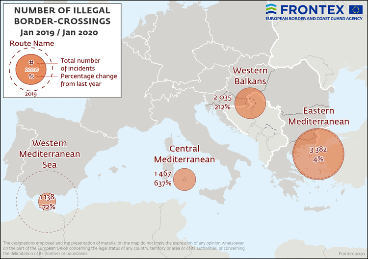
The EU border agency Frontex, for example. Not only does it regularly publish figures on irregular border crossings into the EU, it also supplements the data with visualizations – not with bar charts, but with arrows on maps.
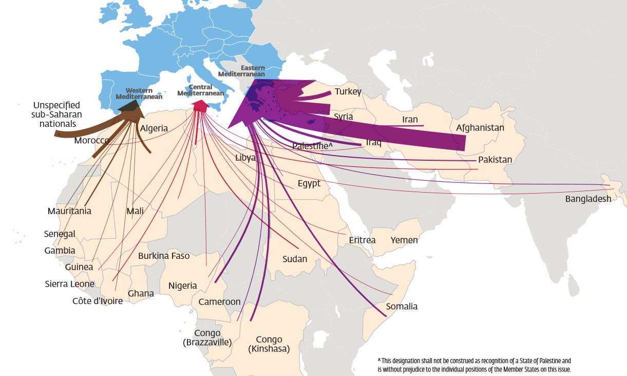
When hordes of people rush towards Europe, as Frontex suggests in its latest annual report , the figures are quickly forgotten – even if they actually fall compared to the previous year.
With its visualizations, Frontex is evidently not about soberly clearing up, but about influencing the public debate. As an EU authority, Frontex is by no means a neutral actor. The agency draws its gigantic budget to combat migration. It is therefore tempting to constantly talk up about the threat posed by migration, in much the same way as the Federal Office for the Protection of the Constitution has to justify its budgets with ever new threats.
How visualizations could become more neutral
Need another example? Although the number of irregular border crossings into the EU has decreased between 2020 and 2021, they still appear just as threatening on Frontex maps. Frontex has simply increased the number of circles from one year to the next, despite falling numbers.
In a detailed article on Frontex maps , Professor of Political Geography Henk van Houtum has shown that the representations by Frontex in particular, but also by other authorities, are not as neutral as they seem at first glance .
There is journalism for visualizations
He also describes how visualizations could be made more neutral, for example by using different display colors, softer colors and comparisons with other numbers. A faster way, however, would be to take their cards away from the authorities and send them back to databases. There is journalism for visualizations.